Analyzing Survivor TV Show data
By Manuel Rademaker in R Data wrangling Data analysis Data visualization Tidyverse ggplot2
June 1, 2021
Description
The data this week comes from the survivorR R package by way of
Daniel Oehm.
survivoR is a collection of data sets detailing events across all 40 seasons of the US
Survivor, including castaway information, vote history, immunity and reward challenge
winners and jury votes.
Full details about the package and additional datasets available in the package are available on
GitHub. The package is on CRAN as survivoR and can be installed for ALL the datasets, themes, etc via install.packages("survivoR").
Additional context/details about the Survivor TV show can be found on Wikipedia.
Data and variables
Taken from the Tidy Tuesday github repository. There are several data sets.
I’m only going to examine the summary data set. Here is a variable description.
summary.csv
| variable | class | description |
|---|---|---|
| season_name | character | Name of season |
| season | integer | Season number |
| location | character | Season geo location |
| country | character | Season country |
| tribe_setup | character | Tribe Setup |
| full_name | character | Full name of player |
| winner | character | Season winner |
| runner_ups | character | Runner ups |
| final_vote | character | Final vote for winner |
| timeslot | character | Time slot on TV |
| premiered | double | Premiered date |
| ended | double | Ended date |
| filming_started | double | Filming started date |
| filming_ended | double | Filming ended date |
| viewers_premier | double | Viewers (millions) at premier |
| viewers_finale | double | Viewers at finale |
| viewers_reunion | double | Viewers for reunion |
| viewers_mean | double | Viewers average |
| rank | double | Viewer ranking |
Setup
require(tidytuesdayR) # to easily get the tidy Tuesday data
require(tidyverse)    # includes dplyr, tidyr, ggplot, forcats etc.
require(visdat)       # for visualizing missing data (and data types)
I always take roughly the same approach when analyzing data that is already reasonably cleaned but not fully tidy yet. Depending on the type of data, additional steps are necessary and some others may be skipped.
Here are the steps I’m going to take:1
- Load data and get an understanding of the variables
- Develop interesting questions/hypotheses
- Tidy/clean
- Address questions/hypotheses
The goal is to come up with 2-3 insightful, publication ready visualizations.
Load data and get an understanding
tt  <- tidytuesdayR::tt_load('2021-06-01')
summary <- tt$summary
dim(summary)
## [1] 40 19
vis_dat(summary)
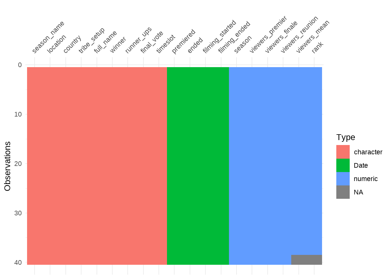
Alright so there are 19 columns with 40 observations. There are some NAs but nothing unusual at first sight.
Develop questions / hypotheses
I don’t know the Survivor TV Show but I assume candidates have to survive some challenges and the last one standing is the winner – I guess?
There is information on how many watched the show and on the time it was aired. There is information on who one and whos the runner up. Lets quickly check if people appear twice.
summary %>%
   count(winner) %>%
   arrange(desc(n)) %>%
   head(6)
## # A tibble: 6 x 2
##   winner      n
##   <chr>   <int>
## 1 Chris       2
## 2 Natalie     2
## 3 Sandra      2
## 4 Tony        2
## 5 Adam        1
## 6 Amber       1
Ok some appear more than one time.
What is tribe_setup?
summary %>%
   count(tribe_setup)
## # A tibble: 31 x 2
##    tribe_setup                                                                 n
##    <chr>                                                                   <int>
##  1 "A schoolyard pick of two tribes of nine new players each; two elimina~     1
##  2 "A schoolyard pick of two tribes of nine new players, starting with th~     1
##  3 "Four tribes of five new players divided by ethnicity: African America~     1
##  4 "Four tribes of four new players divided by age and gender"                 1
##  5 "Nine pairs of new players, each with a pre-existing relationship, div~     1
##  6 "Three tribes of six  new players divided by primary attribute: \"braw~     1
##  7 "Three tribes of six new players divided by dominant perceived trait: ~     1
##  8 "Three tribes of six new players divided by primary attribute: \"brain~     1
##  9 "Three tribes of six new players divided by social class: \"white coll~     1
## 10 "Three tribes of six returning players"                                     1
## # ... with 21 more rows
I guess this somehow describes the how people are grouped to survive?
Just some quick questions that come to my mind
- Look at season ranking over seasons
- Number of viewers by season
- Season ranking and time slot ?
- Variables
viewers_finale,viewers_premiereetc. seem to describe the number of viewers at different “stages” of the season. Will probably convert them to one variable and look at ranking by “stage”? - Did the length of the filming (difference between
filming_ended - filming_started) somehow change over time.
Address questions / hypotheses
Question 1: Season ranking over seasons
ggplot(summary, aes(y = rank, x = season)) +
   geom_line() +
   geom_point() +
   scale_x_continuous(breaks = scales::breaks_width(5)) +
   labs(
      title = "Viewer ranking by season",
      subtitle = "Lowest rank is best; hightest is worst",
      x = "Season",
      y = "Viewer ranking"
   )
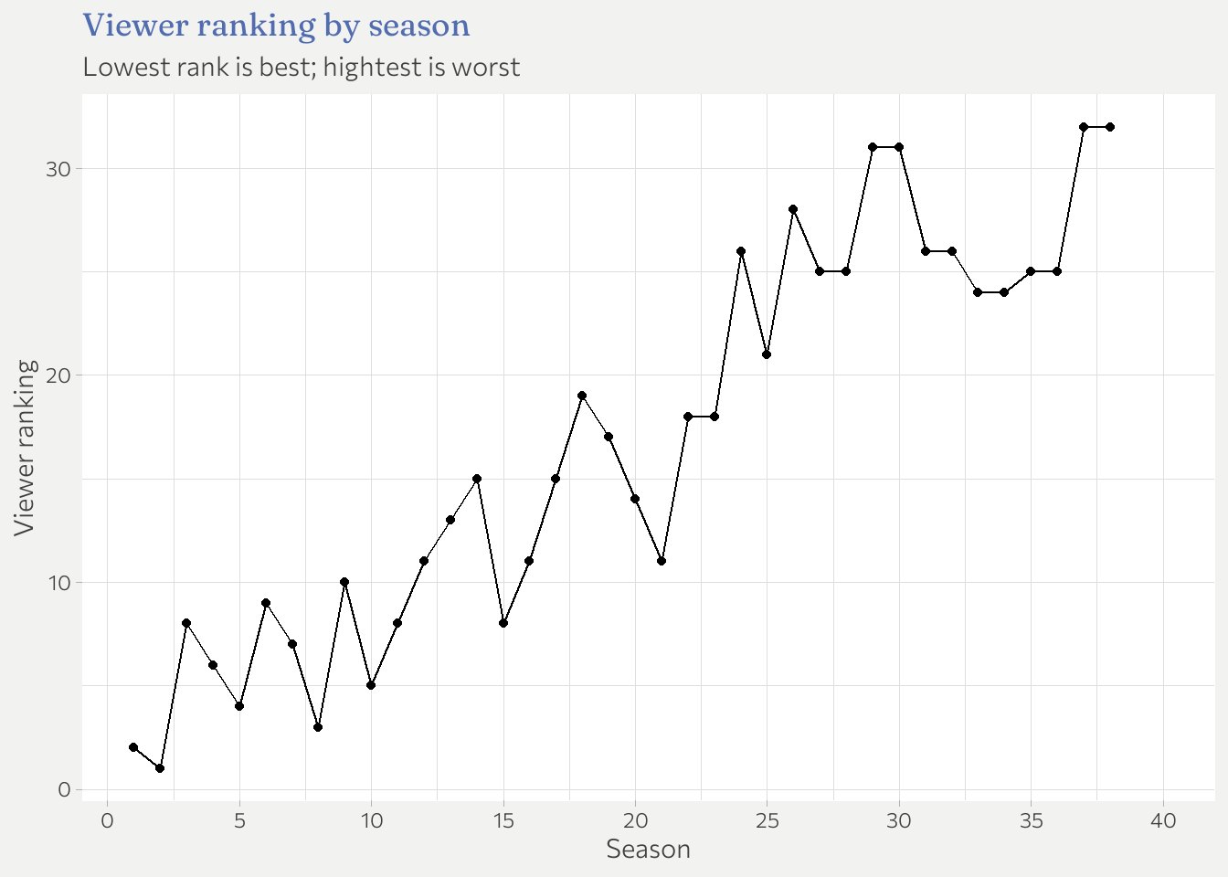 Apparently viewers ranking generally goes up . Since a higher ranking is actually
bad – I assume rank 1 is best – and people might be inclined to think that
higher ranking is good, its probably good to explicitly mention that in the graph.
Apparently viewers ranking generally goes up . Since a higher ranking is actually
bad – I assume rank 1 is best – and people might be inclined to think that
higher ranking is good, its probably good to explicitly mention that in the graph.
Question 2: Number of viewers
summary %>%
   pivot_longer(cols = viewers_premier:viewers_mean,
                names_to = "stage",
                names_prefix = "viewers_",
                values_to = "viewers") %>%
   ggplot(aes(x = season, y = viewers, color = fct_reorder(stage, -viewers))) +
   geom_line() +
   geom_point() +
   scale_x_continuous(breaks = scales::breaks_width(5)) +
   labs(
      title = "Number of viewers by season",
      subtitle = "In million viewers",
      x = "Season",
      y = "# Viewers",
      color = "Stage"
   )
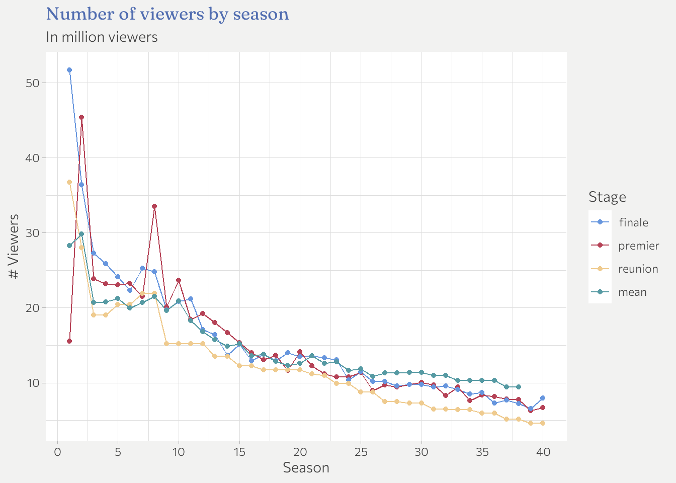 Number of viewers generally declined over seasons. A pretty normal development.
However, the absolute level is still decent with > 10 million viewers until about season
25. I think its also not surprising that the reunion show is typically less well-viewed
than the rest.
Number of viewers generally declined over seasons. A pretty normal development.
However, the absolute level is still decent with > 10 million viewers until about season
25. I think its also not surprising that the reunion show is typically less well-viewed
than the rest.
Question 2.1: Correlation between ranking and number of viewers
ggplot(summary, aes(x = viewers_mean, y = rank)) +
   geom_point() +
   geom_smooth(method = "lm") +
   labs(
      title = "Season ranking vs. number of viewers",
      subtitle = "In million viewers",
      x = "Average number of viewers",
      y = "Ranking"
   )
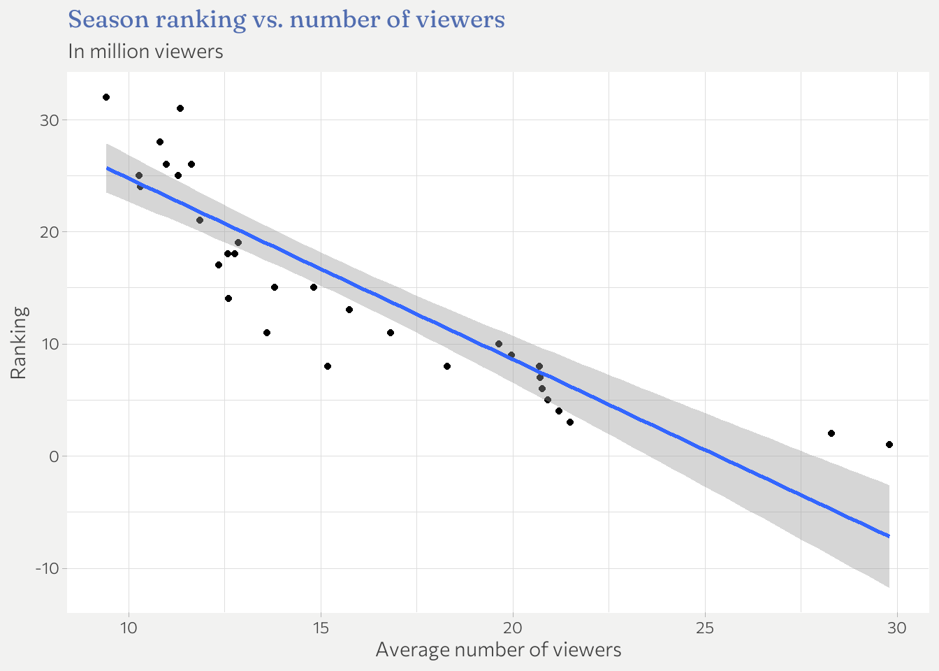
As expected number of viewers is a pretty good predictor for the ranking. In fact lets run a simple linear regression.
summary(lm(rank ~ viewers_mean, data = summary))
##
## Call:
## lm(formula = rank ~ viewers_mean, data = summary)
##
## Residuals:
##     Min      1Q  Median      3Q     Max
## -8.4031 -2.6502 -0.3545  2.7108  8.4166
##
## Coefficients:
##              Estimate Std. Error t value Pr(>|t|)
## (Intercept)   40.8983     2.2870   17.88  < 2e-16 ***
## viewers_mean  -1.6136     0.1444  -11.18 2.93e-13 ***
## ---
## Signif. codes:  0 '***' 0.001 '**' 0.01 '*' 0.05 '.' 0.1 ' ' 1
##
## Residual standard error: 4.519 on 36 degrees of freedom
##   (2 observations deleted due to missingness)
## Multiple R-squared:  0.7763,	Adjusted R-squared:  0.7701
## F-statistic: 124.9 on 1 and 36 DF,  p-value: 2.925e-13
Highly significant. A drop in average viewers per season of 1 million raises the expected rating by about 1.6 rating points.
Length of filming
I wonder if the length of filming somehow decreased. Possible reasons could be: content just needs the be produced quicker, or simply cost savings.
# Create column that counts number of days between two dates
summary %>%
   mutate(
      n_days = difftime(filming_ended, filming_started, units = "days")
   ) %>%
   pull(n_days)
## Time differences in days
##  [1] 38 41 38 38 38 38 38 38 38 38 38 38 38 38 38 38 38 38 38 38 38 38 38 38 38
## [26] 38 38 38 38 38 38 38 38 38 38 38 38 38 38 38
No its pretty much constant and always about 5 weeks.
Summary
As always: there is more to analyze, however, the purpose of this series is not to be exhaustive but to set a time limit and just examine as many questions as possible within the limit.
-
If you reproduce the plots that follow, the appearance will be different but the content is the same. This is because I use a custom theme that is tailored to work well with the overall appearance of this website (same font families, color palettes etc.). If you want to know the details of the theme, check out the code on Github. ↩︎